A mod that adds the Hobbits as a playable faction in the game. |
| Welcome Guest ( Log In / Register ) |
|
 |
Quick Lists Top RatedTutorials Living World Map G Ultimate beginner' Arrow scaling bug Raising Heroes max Proper Fire Arrow Creating an asset. Simple Structure B Making a simple Ma Quick and easy sno Making patrols nea Mods The Dwarf Holds The Peloponnesian RJ - RotWK The Elven Alliance Helm's Deep Last H The Elven Alliance Special Extended E Kings of the West RC Mod The Wars of Arda Downloads BFME1 1.06 Widescr Enhanced W3D Impor Fudge's Map Pack LotR/BfME HD Logos Osgiliath Shellmap Crystals Of Ancien 2v1 Wold The forests of Dru Converted BFME2 an ROTWK animations f |
|||||||||||||||||||
 |
Register and log in to move these advertisements down Scale Mail TutorialTutorial for
There are a lot of applications of this technique, not just for scale mail, but chainmail, anything with repeated patterns. It's a relatively simple technique.
First, create a new document in Photoshop. Set the background to black, a size of 512x512 is will do. This document will be a "raw" document. You could technically draw the scales right onto the skin itself, but I often prefer having a doc full of scale that I can borrow from at later points You'll want to create a scale. To do this, set colour to dark grey and select the pen tool. The pen tool can be a bit complex to use, so I'll try to explain a bit. Your first click creates a point. Subsequent points create more points along the 'path' a single click creates a straight line, but clicking and holding, while dragging, allows you to create curves. This is why the pen tool is so useful. So, place a point somewhere. then, click to place a point below it. next, place a point down a bit and to the side - drag this point so that this segment is curved. Then, complete the scale with another 2 points that mirror the position of the first 2 points. You can edit your shape by holding CTRL and clicking on the points to move them. Once you're done, click on the first point you made - connecting the points and finishing your shape. Voila!  Before the shape can be edited, it needs to be rasterized, so do that now. Then, hit CTRL-T to go to the transform tools and scale it down a bit. At this point my edge was a little blurry, so I went to filters and hit Sharpen-> Sharpen Edges.  But the scale looks plain and ugly. So of course we have to highlight it! Take a dodge brush on highlights with a hard edge. I recommend exposure 30%. Carefully draw a tiny edge around the scale. Then, switch your bush to size 1 and draw a crease line down the middle. This forms the basic highlighting  Now,take a larger, softer dodge brush and highlight the centre area more. This will give the scale some depth. If you wish to add designs to your scales, now is the time- using a high exposure, small sized burn brush on highlights. I'll just add some basic inscriptions. 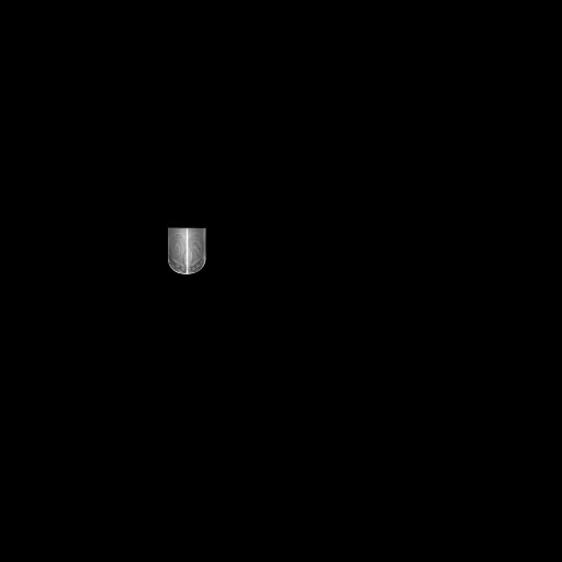 Now, add a quick noise modifier. You'll now want to start setting up the layout of the scales. To do this, simple duplicate the layer a few times and move it horizontally into position. You can merge all these new layers if you like, it will make switching between vertical rows easier. 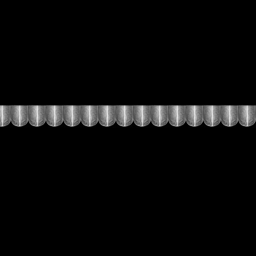 Now we move the row of scales vertically, and maybe a bit horizontally too. Now they will overlap. I only copied it twice, because now we're going to edit the layers. The scales look odd, because there's no shadow at all!. So making sure you're on the layer that's "below", go to a burn brush on highlights, and start drawing in shadows. You want to take the shape of the scale into account here- which parts will cast shadow and which parts are too close to the surface to do so. This is largely a subjective process- do it with all 3 layers until done. 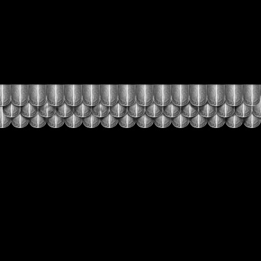 Now that the shadows are in, you can start adding some extra highlights to the edges. Now is also the time for variation- add scratches, dents, stuff to make each scale unique. All this is done using small, sharp, dodge and burn brushes. 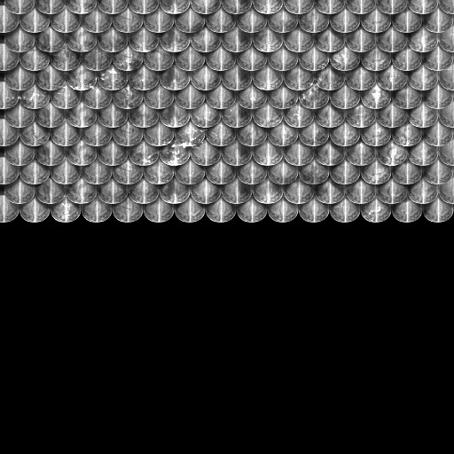 As you can see, I cloned the layer a couple more times too. However, most armour isn't this shiny. So... there are a couple ways to make it look a little more used. A rust mask is a transparent layer that is applied over top of your texture. It filters through and gives it a bit of a dirty look. So, take a red-brown brush and start drawing icky globs of rust and brown all over the texture! (MAKE sure to create a new layer to do this on FIRST!). Then do it again with a darker color. 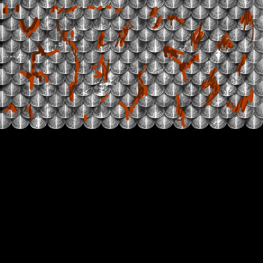 There are a few ways to make this look much better. First of all, apply a vertical motion blur of around 10 pixels to draw it out. Then apply a Spatter filter - play with the settings, I recommend low smoothness though. 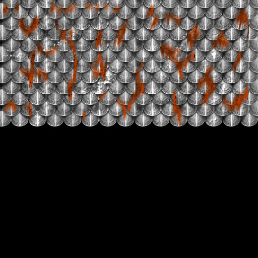 Still looks bad. You need to change the layer mode. Switch it to multiply, and set layer opacity at around 40-70%. Add more if you wish. I ended up with this: 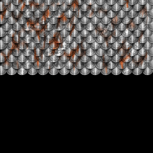 There are also a couple more things you can do to improve the look of the scales. This includes adding an inherent tint to them- go to the Hue/Saturation panel (CTL+U), and tick the 'Colorize' box while on your scale layer. Try a hue of 23, a saturation of 10. This is what I ended up with. It's probably a bit too uniform, but should do for skinning uses. 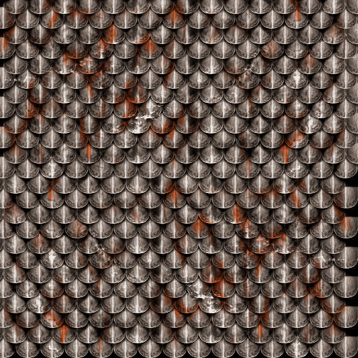 |
 |
|||||||||||||||||||

"One site to rule them all, one site to find them, © All Rights Reserved Eric Edwards ©2013. |
|||||||||||||||||||||


 BFME 2