
Good mod in BFME2?With more Factions? and its coming? It's MEN'S KNIVES! |
| Welcome Guest ( Log In / Register ) |
|
 |
Quick Lists Top RatedTutorials Living World Map G Ultimate beginner' Arrow scaling bug Raising Heroes max Proper Fire Arrow Creating an asset. Simple Structure B Making a simple Ma Quick and easy sno Making patrols nea Mods The Dwarf Holds The Peloponnesian RJ - RotWK The Elven Alliance Helm's Deep Last H The Elven Alliance Special Extended E Kings of the West RC Mod The Wars of Arda Downloads BFME1 1.06 Widescr Enhanced W3D Impor Fudge's Map Pack LotR/BfME HD Logos Osgiliath Shellmap Crystals Of Ancien 2v1 Wold The forests of Dru Converted BFME2 an ROTWK animations f |
|||||||||||||||||||
 |
Register and log in to move these advertisements down Texturing the Golasgil Household Knights
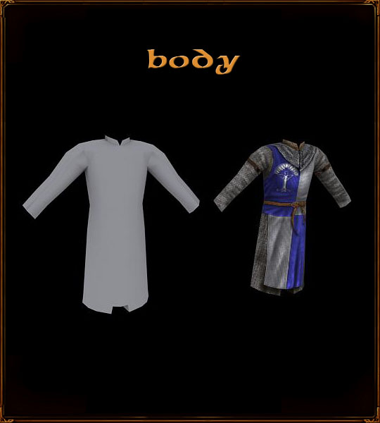 The body is the largest section of the texture, so I will spend a lot of time on it. It has many components - the chainmail, the surcoat, belts, etc. Firstly, Iâll draw some details onto the undershirt that will be covered by the chainmail. While it may seem a bit silly, considering that itâll just be covered by the chain a bit later, sometimes it is useful, besides good loose cloth practice. So I hide any layers on top of the undershirt layer (it's the tan colour here), and smooth some of the edges. 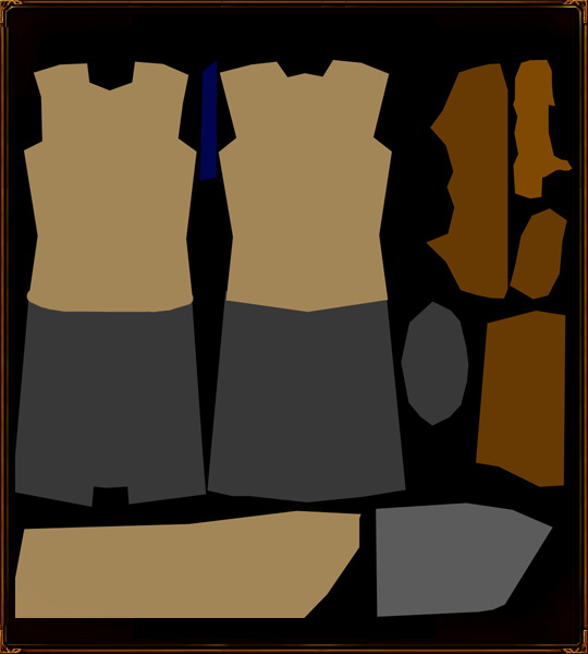 Using burn on highlights to lay down some basic shadows and folds 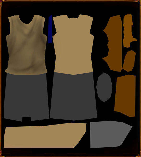 Using dodge on highlights to lay down some highlights that correspond to the folds. This is a really loose shirt, really only padding for the chainmail. 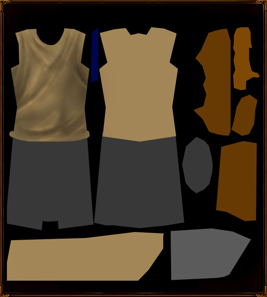 Repeating the process for the back of the shirt and the sleeve. 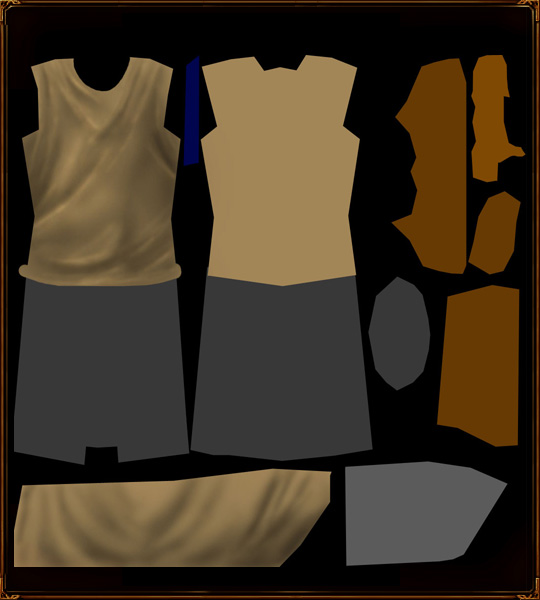 This also serves to let me see any mapping errors and inconsistencies, which was sortof a must this time, as I admit I mapped this differently than I usually do. I look for strange bends and intersection points 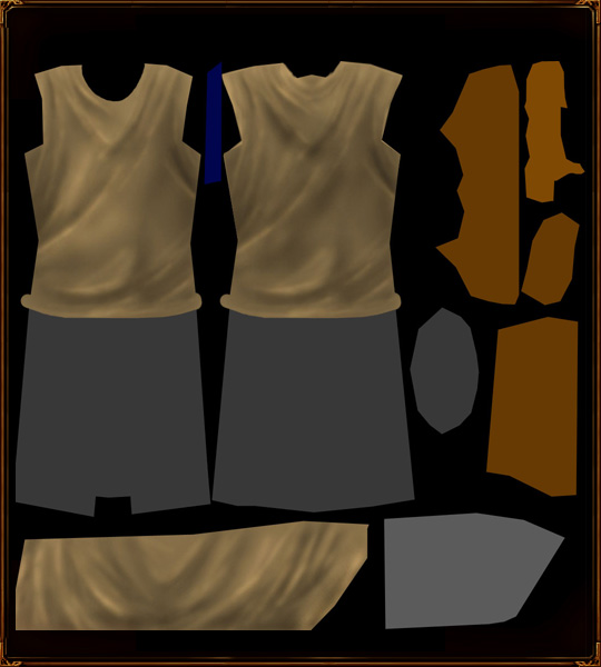 Chainmail Now I am going to add the chainmail, so I drag the chainmail layer over from the other document and resize it to something that makes sense for chainmail. Since the scaling on the arms may be different, I make sure check it on the model 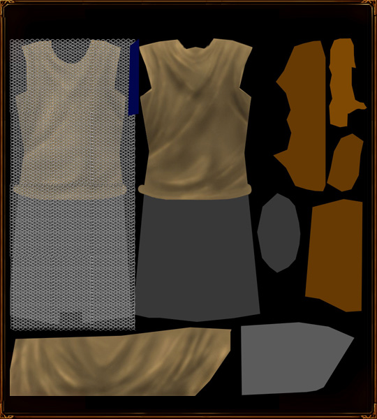 Next the chain should be cut out to fit the areas needing chainmail. Rotation and warping are key to make it work with the model. You want the chainmail to look like itâs wrapped around the model, not slapped on 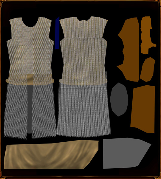 Next I darken the undershirt layer significantly. 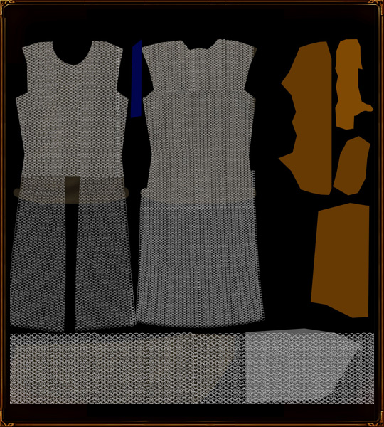 Now to improve the look of the chainmail. I do this by creating contrast between rows of chain: alternating dodging and burning the columns of links. 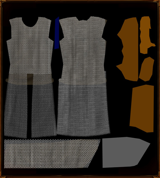 Begin some general shape highlighting and shadowing. Shadows under the arms, brighter on the upper chest, etc. 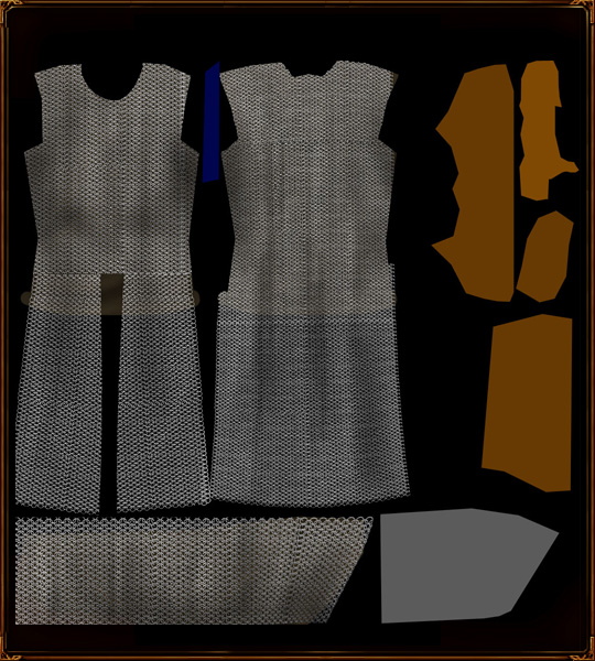 Then adding folds and such in the chainmail. These will be stiff, minimal folds due to its nature. Inspect the role of the belt, and the position of the arms. 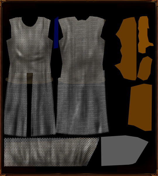 Next, I like to take a bunch of random spatter brushes and attack the chainmail with them. Set on dodge, sharpen and burn, they will break up the chainmail even more and give it a bit of age and variety. Dented areas, protruding areas and the like really add character. Surcoat The surcoat plays an important role in this model. Itâs a grey and blue patterned thing, divided into 4 quadrants. It really forms the primary coloured bits of the model too. After I unhide the surcoat layers, the first thing I do is naturalize it â removing any sharp edges and designing fold locations. Where folds exist, the cloth will not just hang down, it may be slightly bent out of shape, and this will influence the shape 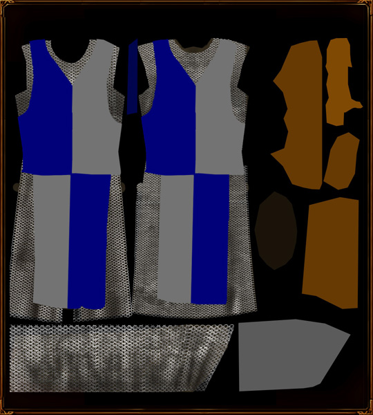 I will also add a basic belt, to determine the approximate location of the beltâs shadow and associated effects on the cloth. 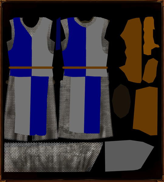 This surcoat will button up the back, so I draw a cut line down it, and add appropriate shadowing 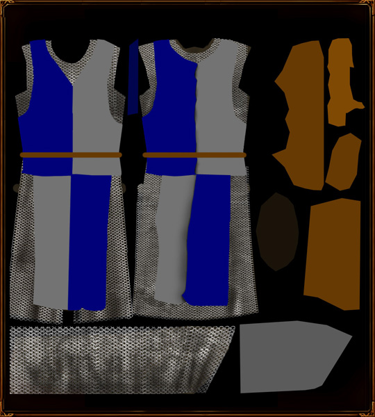 Now I develop the folds around the points where the surcoat buttons up with the burn tool 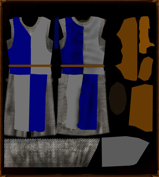 More and more shadows, now on the rest of the surcoat 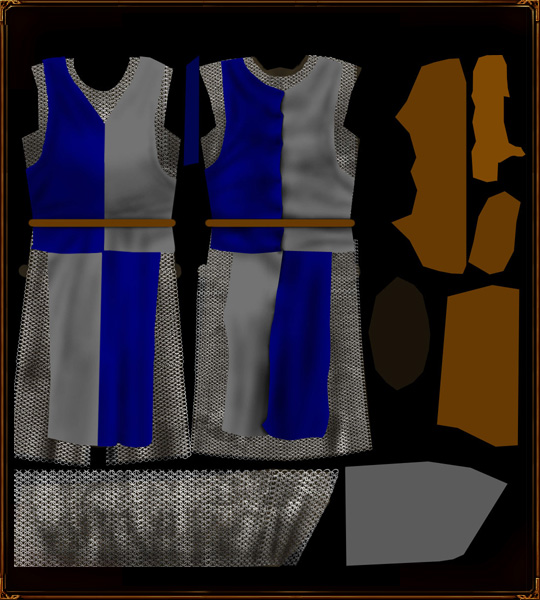 Then some highlights to correspond with the shadows. With these I start out with a large brush, then move on to a smaller brush as I define fold more and more. brushes are never sharp. 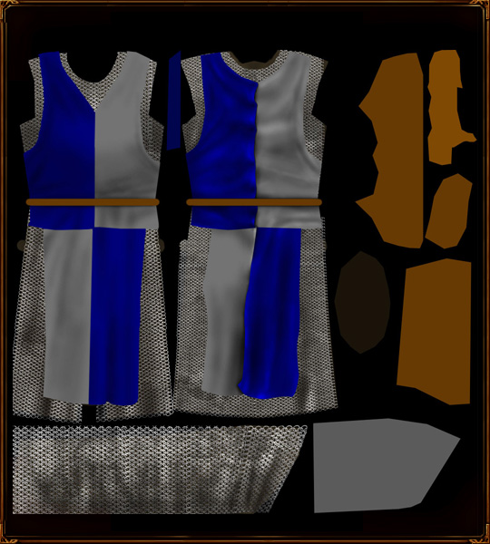  Though the highlights are still messy and too deep, Iâll add some other details first. Now that the shape of the surcoat is established, I can draw shadows on to the chainmail layer below. First, with a hard brush along the entire edge. 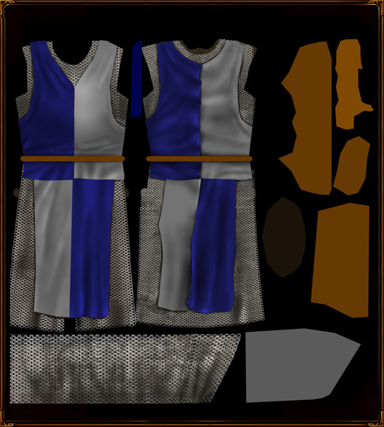 Then, some fuzzier, deeper shadows around looser fabric junctions.  Then, I wish to seal the edge of the surcoat, by drawing an edge along it. This is done with a sharp burn brush and patience galore. Then, a fuzzy dodge brush on the seam that it created. Again, patience.  Then, stitching between the different colours of fabric. Just a simple burn line, with dodge to create some illusion of depth.  Next, some holes for the ties that would hold the surcoat on. After blacking out the locations of the holes, I draw some metal rings into the edges of the holes. This is done in the same method as the chainmail rings. 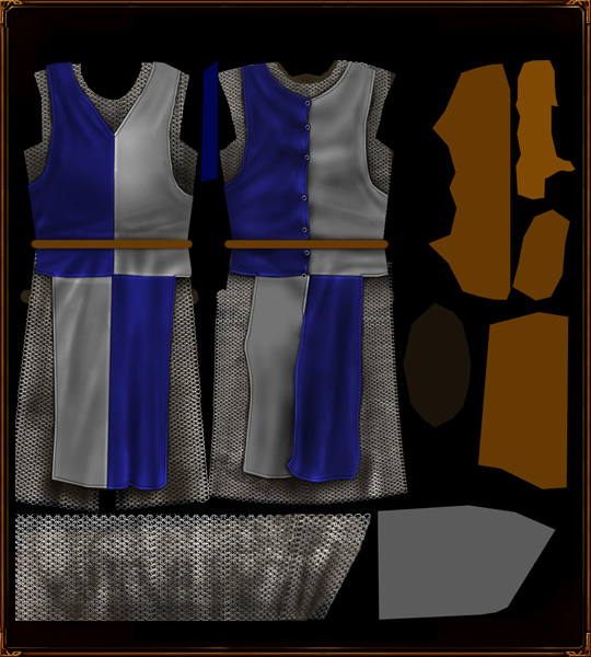 And further shadows and highlights to inset the rings properly. And then further shadows. I also cut the brightness of the grey panels, as the highlights were dragging them towads white. 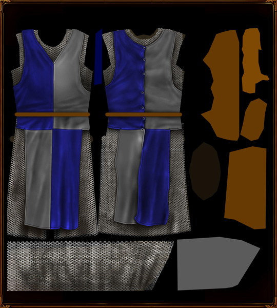 Now for a tricksy part. I use the Texturizer to generate a canvas fabric, and tweak it slightly. you could also photosource something, or even draw it, but you'd have to be really keen to do that. Black and white, decent contrast is needed. Then I size it to create a nice texture for the cloth. 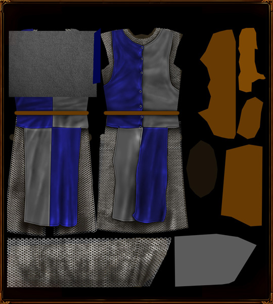 Then I set the layer mode to colour dodge and adjust levels to create enough texture. 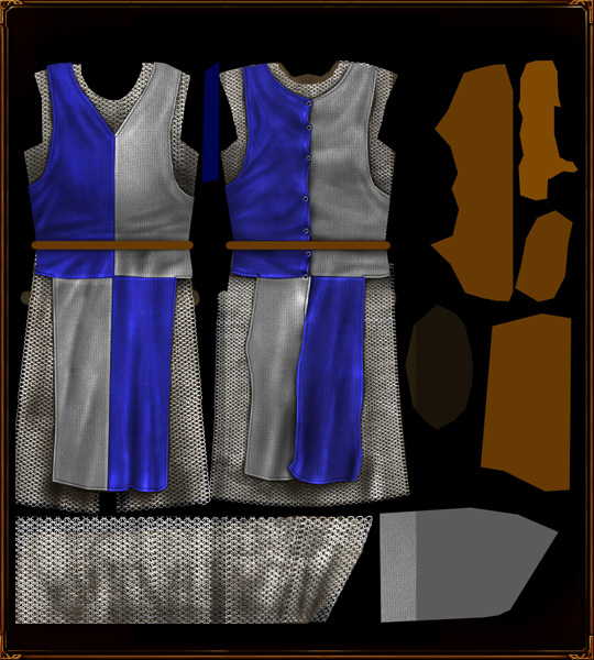 Then I cut it out in the shape of the surcoat, no use applying a cloth texture to the chainmail! Notice that things are a lot brighter behind the colour dodge, so the saturation and brightness of the surcoat must be decreased. 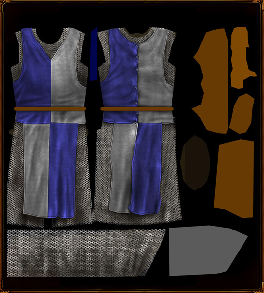 Symbol Now, a bit of a side-trip to make the Anfalas emblem. I am going to use a stylized white tree, based vaguely off Tolkien's own White Tree art. So, I take the pen tool and draw the tree. Well, half the tree. 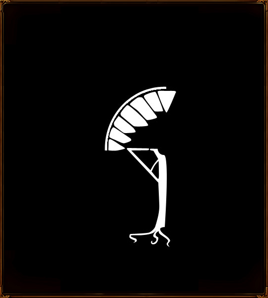 Now the other half. 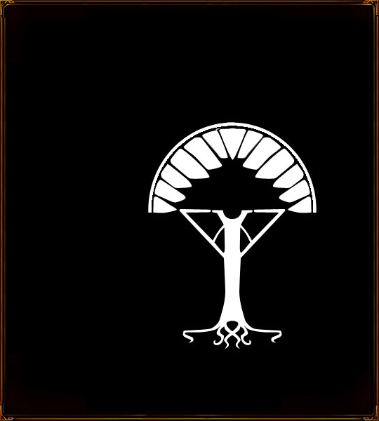 The tengwar L for Langstrand will complete the tree. 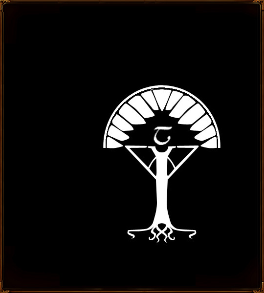 The symbol is added to the surcoat, placing it under the cloth texture so the symbol inherits the texture. 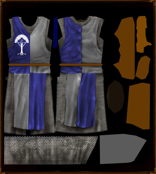 Now I darken it, because I want a silver tree... some highlighting, and I attack it with the sharpen tool to make it a bit sparkly.  To make it stand out, I use a pillow emboss, with high smoothing.  Then some more precise dodging to increase the silveriness.  Now for additional detail â shadows on the texturized layer. The irect effect of this is to increase or decrese texture intensity, so you can kill the texture in dark areas or increase it in areas you want to reveal the fabric's qualities.  Next, adding some more details to the surcoat.specifically, the ties for the loops at the back. Basically I just draw a brown knot, then highlight with a thin dodge brush to give the strap some depth.  Then some dodging to add depth.  Then down with the saturation on the ties, because they're too bright.  Then shadows on the surcoat itself, which will help the ties stand out.  Collar Now I proceed on to the collar area. This will be a nice royal blue, I believe, so blue is applied to the area!  Some basic highlights and shadows to move it away from the surrounding chain  The dividing line of the two halves and more highlights. 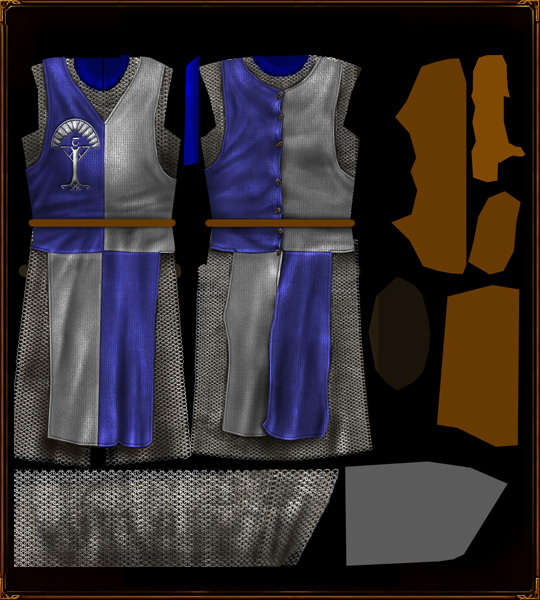 I want the collar to look vaguely rough, so a bit of noise is added. This will (as in my cloth tutorial) provide some texture.  Then some designs on the lapel, for this I use the pen tool and draw a path (not a shape), then stroke it with a thin brush.  I highlight these lines until they look more silver, and draw some more appropriate shadows to make them stand out  At this point I decided the blue did not contrast enough with the surcoat, so it turned brown. Simple Hue/Saturation change. 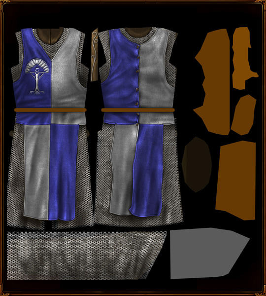 Now I need to add the chainmail coif. I used a black brush to plan out where it would go. 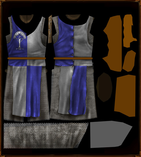 More chainmail, taken from the chainmail file. The warp transform is used to bend it into shape.  Shadows and highlights on the chainmail.  Application of shadows to the surcoat, drawing out the chainmail.  Now some clips for to chainmail to button up on.  Then shadows of the clips on the chainmail, and some corresponding highlights.  Duplication!  Belt The belt was already partially blocked out- I just added the sword-belt.  The belt buckle must be created first. I choose a style I like, then draw it using the pen tool.  now for some details, using a small burn brush I draw a line down the middle and counter-highlight it.  Now for figuring out how the buckle will work... I use different colours for different layers for reference only.  Now for highlights and shading - the need for different colours is removed once the shading defines what goes over what. Pay attention to shadow depth, it determines how the belt's ties work.    Now some belt designs: I'm going for a nice wavy pattern, drawn in black with the pen brush.  Layer mode: colour dodge, and the layer is also beveled. 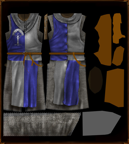 Pattern duplicated along the main belt and warped where necessary.  Desaturation, because of colour dodge's effects.  Some re-highlighting. 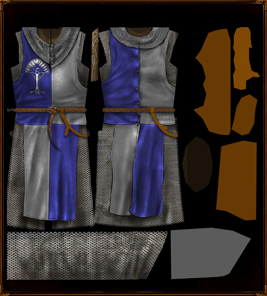 Now we work on sword belt bits, firstly the buckle, drawn with the pen tool.  Shadows around the buckle help define where things overlap or slip underneath  Highlights on the buckle to give it depth ,and holes in the belt for the buckle to act upon. Done using a paintbrush.  More highlights on the belt defining edges and rounding things.  Shadows mirroring the highlights  A bit of darkening due to extravagant colours.  Some sharper highlights really change how the edges are seen - now they seem pushed forward instead of lying back.  CommentsDisplay order: Newest first | Page: 1, 2, 3 {IP}Sauron - Thursday March 26, 2009 - 12:18 You make it look so easy :P Puppeteer - Wednesday July 2, 2008 - 10:27 I wish I understood how the pen tool works, those patterns look great but I'm finding hard to replicate Persus - Tuesday April 22, 2008 - 3:52 Can you send me a link to the splatter-brushes which you use? LotrCrushah - Saturday March 8, 2008 - 23:57 this is the best tutorial on skinning and texturing ive ever read ={D Fingulfin - Wednesday November 21, 2007 - 23:14 =O Bart (Administrator) - Wednesday September 5, 2007 - 3:09 2 hours is nothing. skinning (and other artforms) take patience Guess Who - Tuesday September 4, 2007 - 23:22 whoa 2 hours well i found out how to use the elipse tool thanx to matias. m@tt (Team Chamber Member) - Tuesday September 4, 2007 - 10:54 Not when Nertea spends at least 2 hours on a skin Guess Who - Tuesday September 4, 2007 - 2:57 make a video tutorial that would be so easy to follow ;) Juissi - Sunday September 2, 2007 - 8:52 I have Photoshop 7 and even that has it :P |
 |
|||||||||||||||||||

"One site to rule them all, one site to find them, © All Rights Reserved Eric Edwards ©2013. |
|||||||||||||||||||||


 Previous